Back to Works
Case Study
Solo Designer
2026

Background
TemuDataku is a data science mentoring platform that connects mentees with experienced mentors to accelerate learning. The platform helps data science learners receive one-on-one guidance, assignment feedback, and practical advice from mentors.
Current Condition
The TemuDataku admin dashboard tracks users, programs, participant progress, and assignment submissions. However, they have several issue about the dashboard, such as:
The information structure is not well organized
Important data is difficult to find and prioritize
Monitoring progress and activities is inefficient
User Goal
“Our team needs a dashboard with a clearer structure for quick monitoring of users, programs, and progress.”
— TemuDataku's Internal Team
Project Goal
Enhance the dashboard with a clear information structure and prioritize key data to make it easier to monitor and manage data.
User Target Criteria
TemuDataku Admin & Internal Team
Program administrators and participants (mentees)
Role
UI/UX Designer
Project Timeline
14 - 16 March 2026
Benchmarking
Benchmarking was conducted to examine similar existing platforms, with the aim of analyzing layout structures, UX patterns, and other features:
Competitor | Result |
|---|---|
Udemy | Udemy emphasizes structured and task-based navigation, allowing users to focus on specific activities such as tracking performance, managing students, and engaging with assignments in a clear and organized way. |
Superprof | Superprof focuses on efficient data management through table-based layouts, enabling users to easily filter, organize, and control large amounts of information such as schedules, bookings, and reviews. |
Revou | Revou highlights the importance of visual clarity in monitoring by combining KPI summaries with color-coded status indicators, allowing users to quickly understand participant progress and engagement. |
Opportunity to Design Solution
With the aim of identifying opportunities that serve as a reference for design solutions and direction:
Opportunity | Design Direction/Solution |
|---|---|
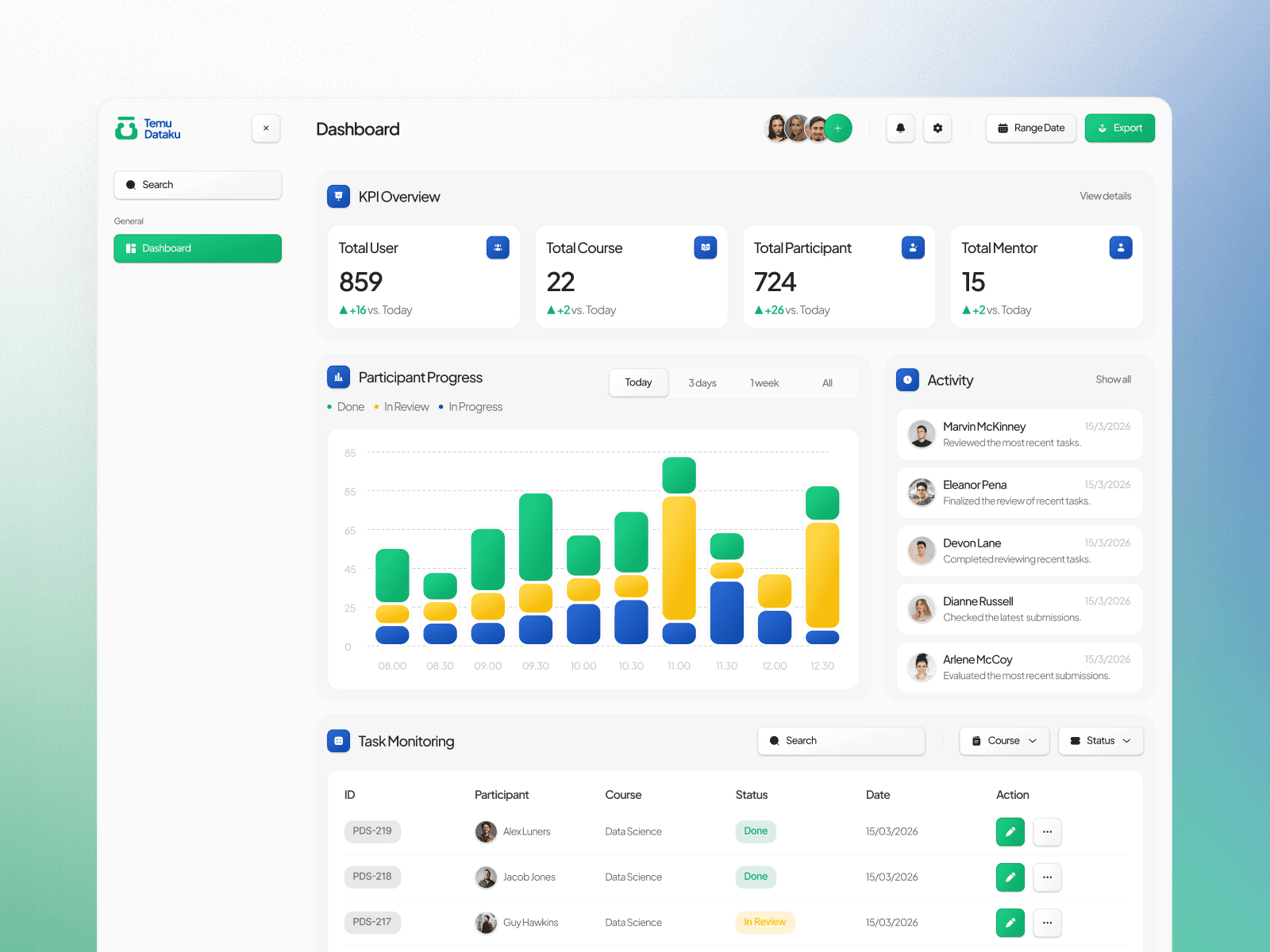
Users need a quick preview in a single dashboard to facilitate data analysis. | KPI cards to display the total number of users, courses, participants, and mentors as a platform overview. |
Users need a more visual way to easily monitor participant progress. | Progress charts to display the statuses Done, In Review, and In Progress. |
Users need information on participants’ latest activities. | An activity panel to display the latest activities in real-time |
Users need an efficient way to monitor and manage participants’ tasks. | A participant monitoring table with program information, status, and actions |
Design Strategy
The design strategy focuses on visual elements and layout structure to ensure that the dashboard is easy to understand, consistent, and supports the efficient monitoring of participants.
Design Strategy | Reason |
|---|---|
Minimalism Style | To reduce visual clutter and help users focus on the most important information. |
60% – 30% – 10% Color Rule | To maintain visual balance and ensure the brand colors remain dominant. |
Using a bento layout to prioritize sections. | To group important information into distinct areas so that admins can easily find key information. |
Consistent Layout System | To create a familiar experience so users can quickly understand the dashboard’s structure. |
Design Execution
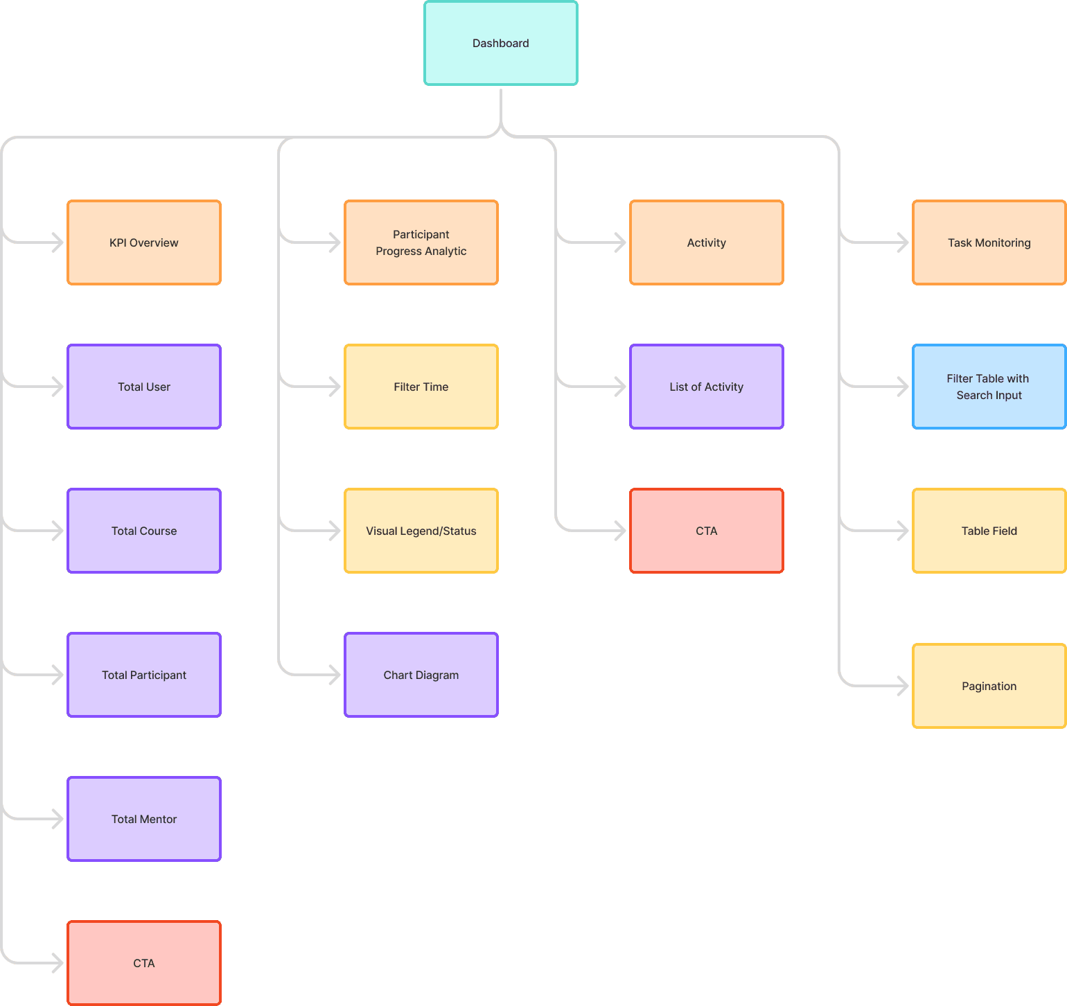
Information Architecture
The information architecture is designed to organize information based on the admin’s needs hierarchy:
Design System
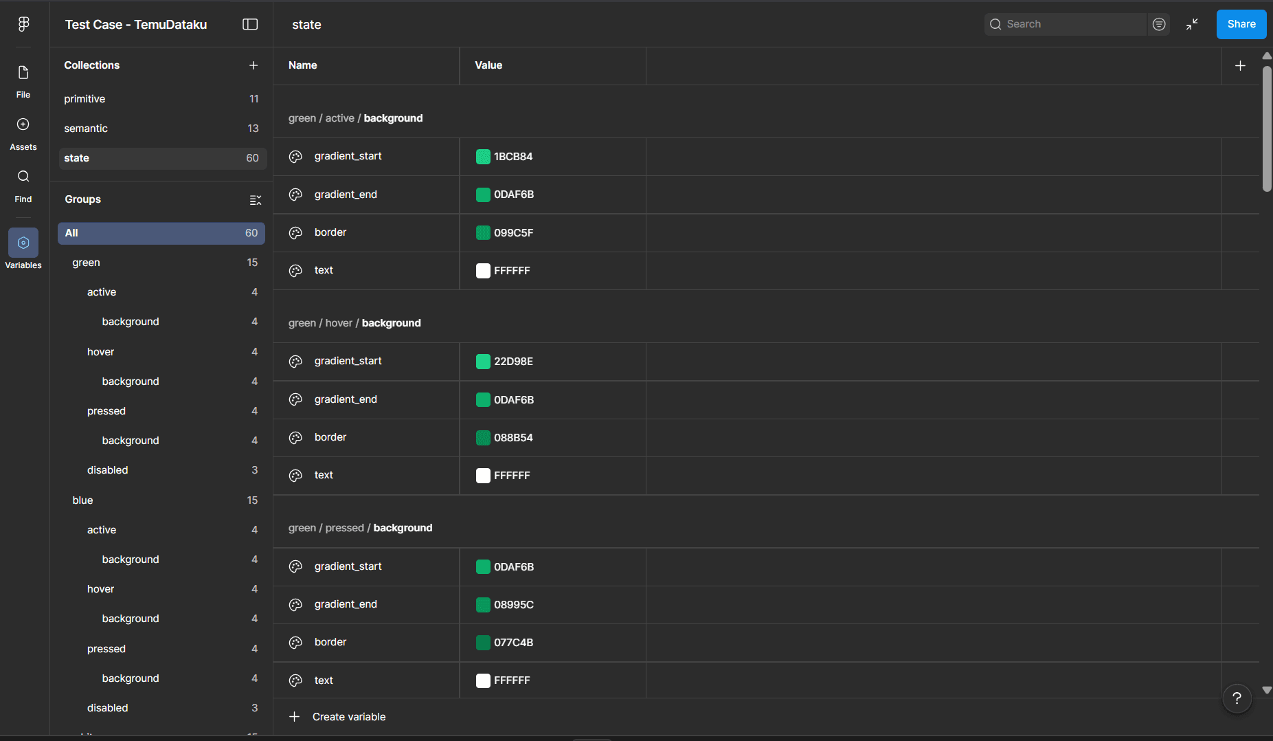
Color Token
I structured the color system into primitive, semantic, and state tokens to maintain consistency across the interface.
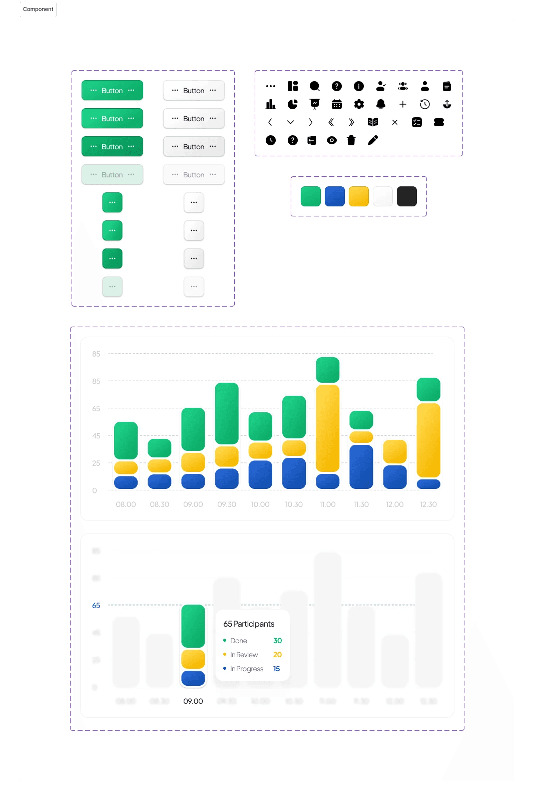
Component & State
I designed reusable components such as button, icon, and chart interaction to maintain consistency across the interface.
UI Output

Closing Reflection
Through this project, I honed my skills in UX research, design thinking, and design exploration to translate insights into clear solutions. This test case helped me deepen my understanding of design systems and components to ensure more consistent designs that are well-reasoned and have a positive impact on dashboard usability. Thanks!