Back to Works
Case Study
Solo Designer
2025

About The Project
Danantara Indonesia is a sovereign wealth fund managing national strategic investments. Despite its institutional significance, the original website created a gap between its strategic importance and how users perceive and trust it.
Why I Redesign This?
In 2025, when Danantara Indonesia launched as a sovereign wealth fund, its website became a critical touchpoint for communicating credibility and transparency to the public. However, the experience did not fully support this role.
Problem | Users Feel |
|---|---|
Weak Trust Signals | Users feel uncertain about credibility due to unclear institutional communication and poor visual authority. |
Hard to Scan Content | Dense text layout and inconsistent hierarchy made it difficult for users to quickly find and understand key information. |
Unintuitive Navigation | Navigation structure felt misaligned with user expectations, causing confusion when exploring the site. |
Redesign Goal
So, the redesign aims to Improve how users access, understand, and trust institutional information through clearer structure, better visibility, and more intuitive navigation.
Research Approach
Due to limited access to primary data, this research focuses on website preview and competitive benchmarking.
Website Preview
To identify interface problems, I reviewed the current Danantara Indonesia website directly. Below are the key sections I examined and the issues I found that directly connect to user pain points.
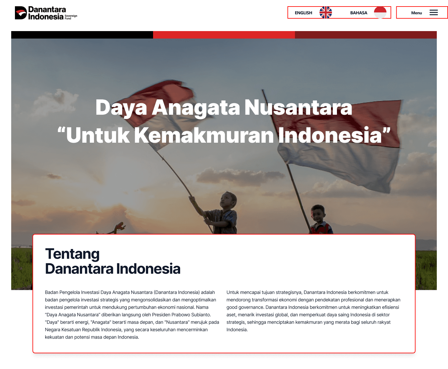
Section 1: Header, Hero Section, About
Navigation items and language toggles lack visual weight, blending into the header. The hero presents a large headline but no clear CTA or entry point for first-time visitors.
Pain Point: Navigation feels unintuitive
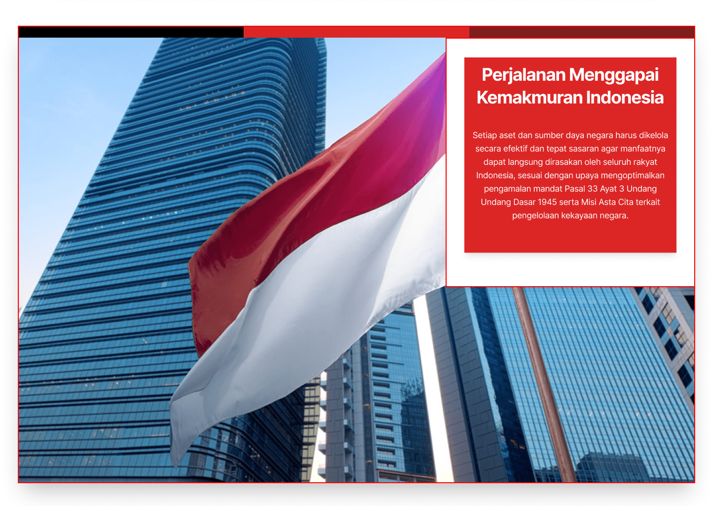
Section 2: Content Layout - Journey Section
Floating text cards overlaid on full-bleed photography create contrast issues. For an institution needing to communicate authority, poor text legibility directly weakens trust.
Pain Point: Users struggle to scan and understand content
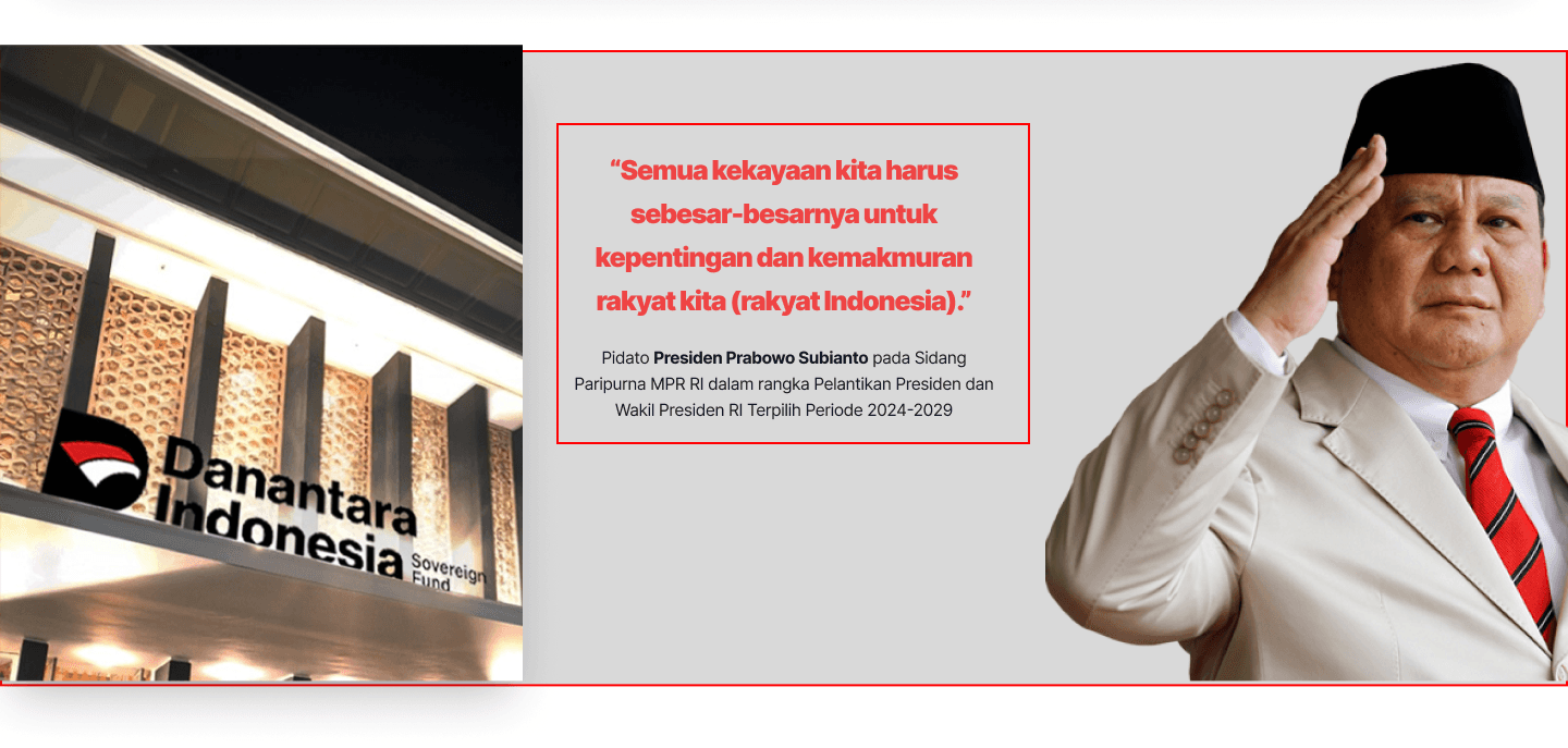
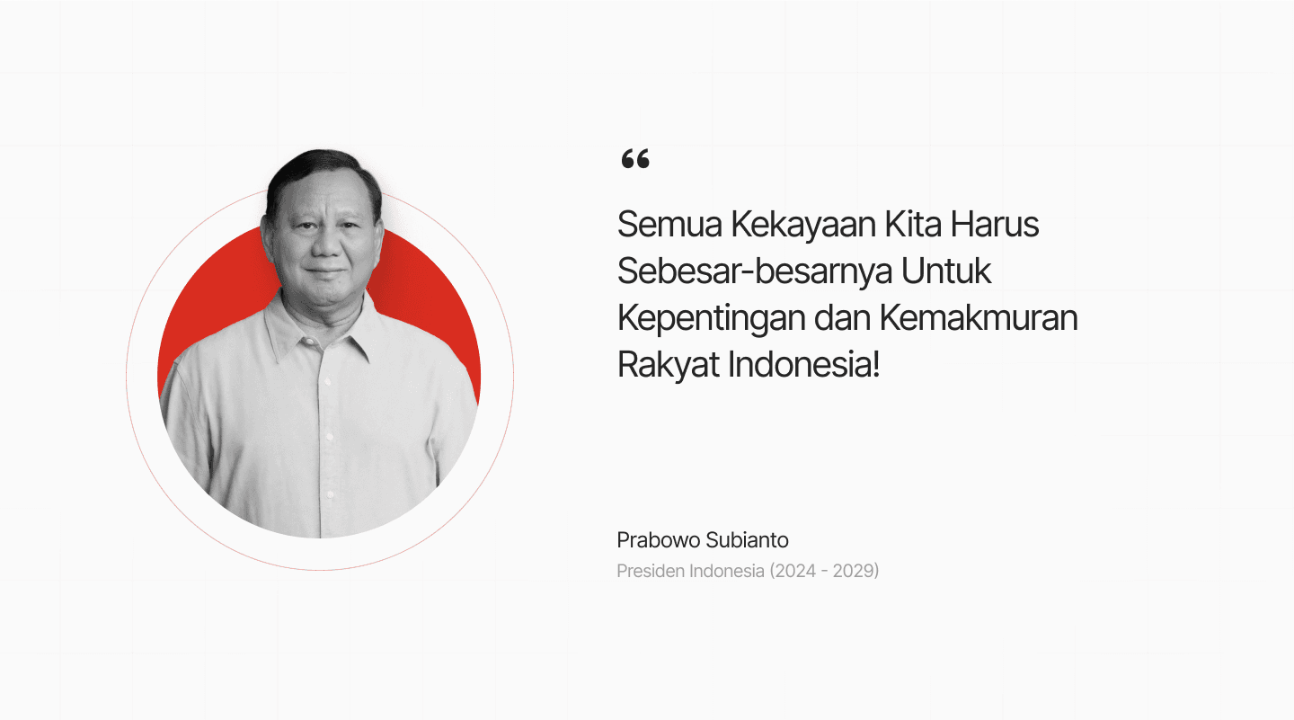
Section 3: Presidential Quote Section
The strongest credibility asset on the page. A quote is presented in a visually unpolished layout with awkward image placement, undermining institutional authority.
Pain Point: Users feel uncertain about credibility.
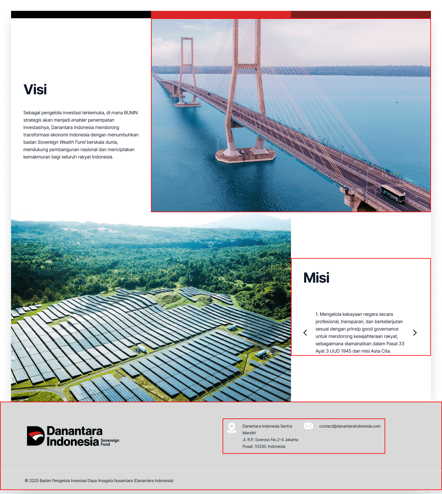
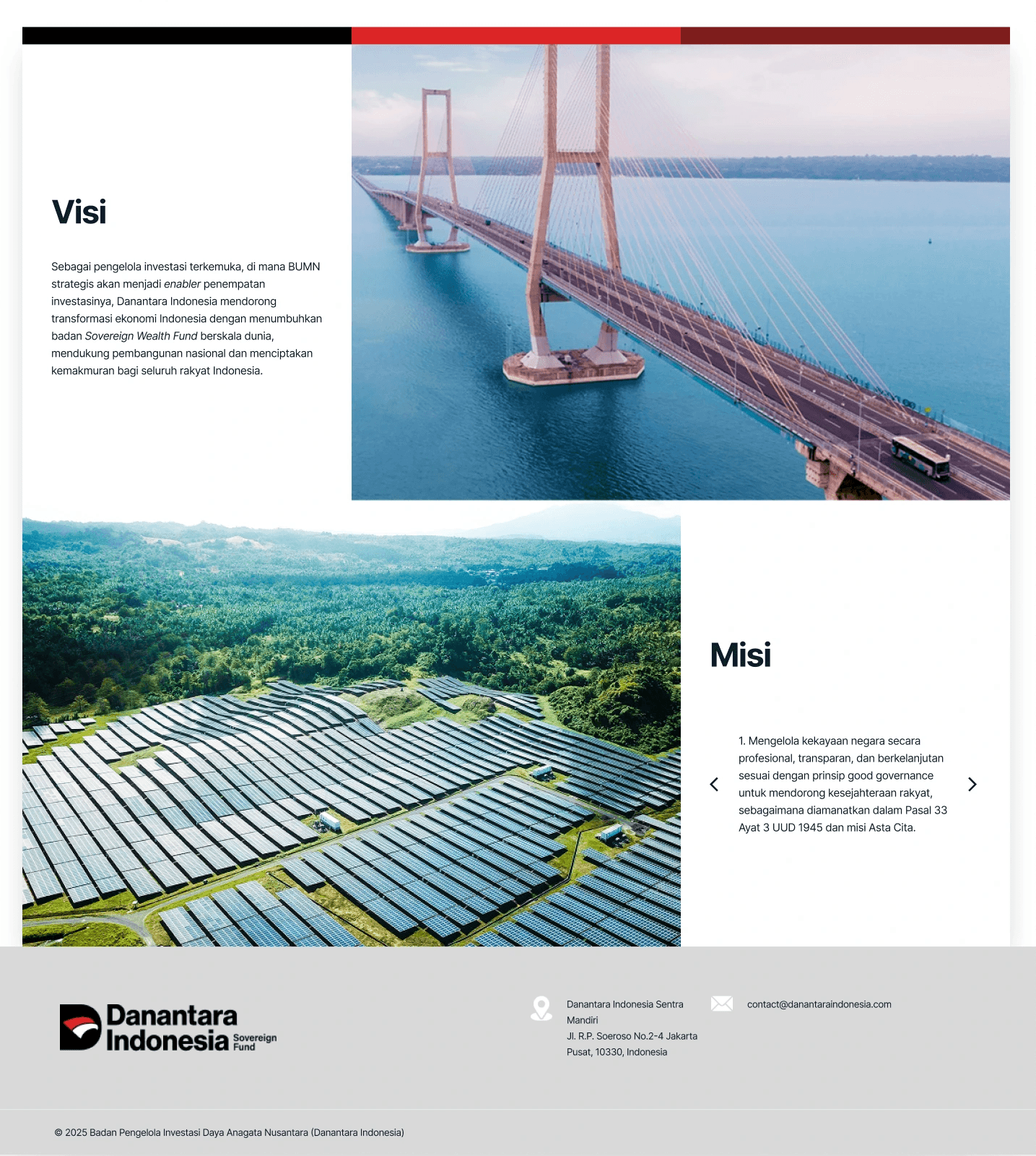
Section 4: Vision, Mission & Footer
Vision and Mission is the most critical sections for any institutional website are fragmented across competing photo backgrounds. Key information is buried, not surfaced.
Pain Point: Important information is hard to find
Competitive Benchmarking
To understand how credible financial institutions communicate trust and transparency, I analyzed Temasek, Norges Bank Investment Management, and Indonesia Investment Authority (INA).
Competitor | Key Pattern Observed | Applied to Redesign |
|---|---|---|
Temasek (SG) | Clean top-level navigation with clear institutional categories. Credibility anchored in data | Restructured nav to reflect user intent: Profil, Strategi, Transparansi, Berita. |
Norges Bank IM | Transparent data is prominently displayed above the fold. Performance metrics lead the page | Surfaced key stats w/ partners (AUM, BUMN count) early in the hero section |
INA (Indonesia) | Credibility signals (governance, reports) are visible early without requiring deep navigation. | Added dedicated Transparansi section and news feed to communicate ongoing activity. |
Key insight: Trust is built not only through content, but through how information is structured and surfaced early in the user journey.
Opportunity Areas & Design Solution
Based on these findings, I identified several opportunity areas to improve clarity, transparency, and user trust.
Areas | Solution |
|---|---|
Lack of transparency in information | Surface transparency through a dedicated section for reports, governance, and public data |
Important information is hard to find | Improve navigation and restructure content based on user intent. |
Limited communication about institutional activities | Introduce a news and updates section to make ongoing activities more visible |
Strategy and performance are not clearly explained | Present strategy and performance data in a structured, easy-to-understand format |
Design Strategy
The design strategy focuses on improving how users process information, not just visual aesthetics.
Strategy |
|---|
Minimalism is used to reduce cognitive load, helping users focus on critical institutional information without distraction. |
The 60–30–10 color rule is applied to guide user attention toward key actions and important data, improving scannability. |
A strong visual hierarchy ensures users can quickly identify and prioritize important information. |
Consistent layout patterns reduce learning effort, allowing users to navigate the website more intuitively. |
Accessibility principles ensure the content is inclusive and readable for a wide range of users. |
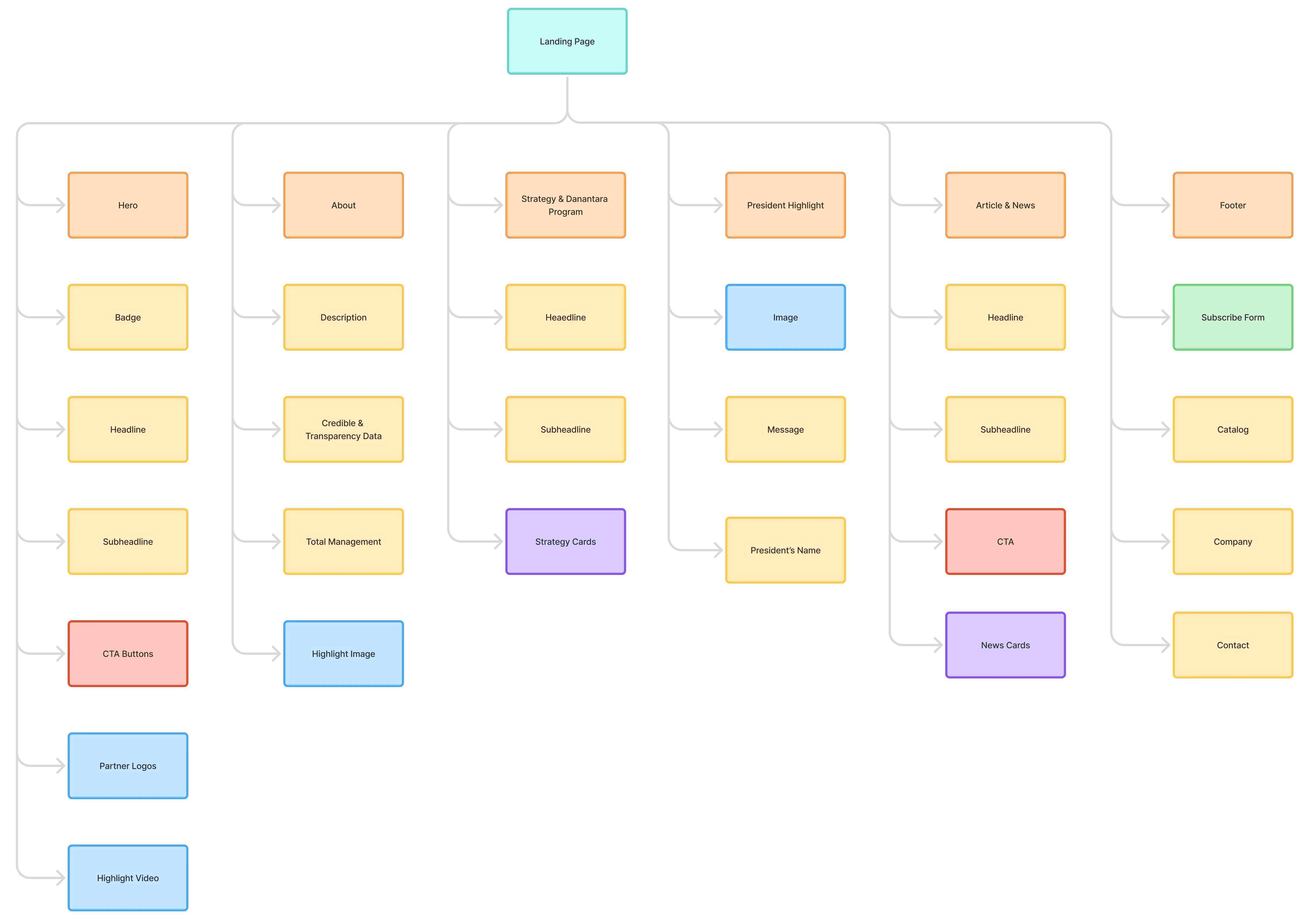
Information Architecture
Design System
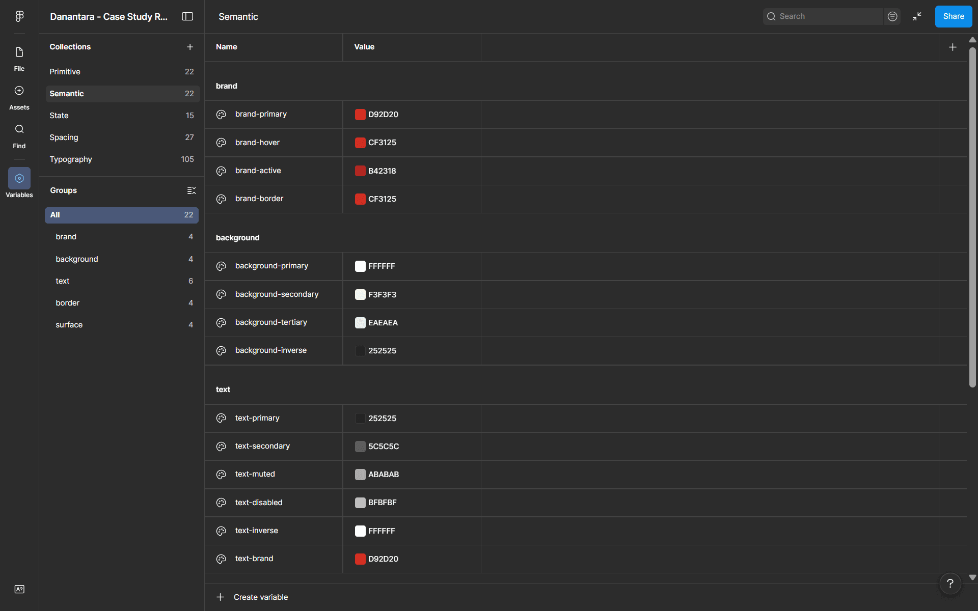
Color Token
I structured the color system into primitive, semantic, and state tokens to maintain consistency across the interface.
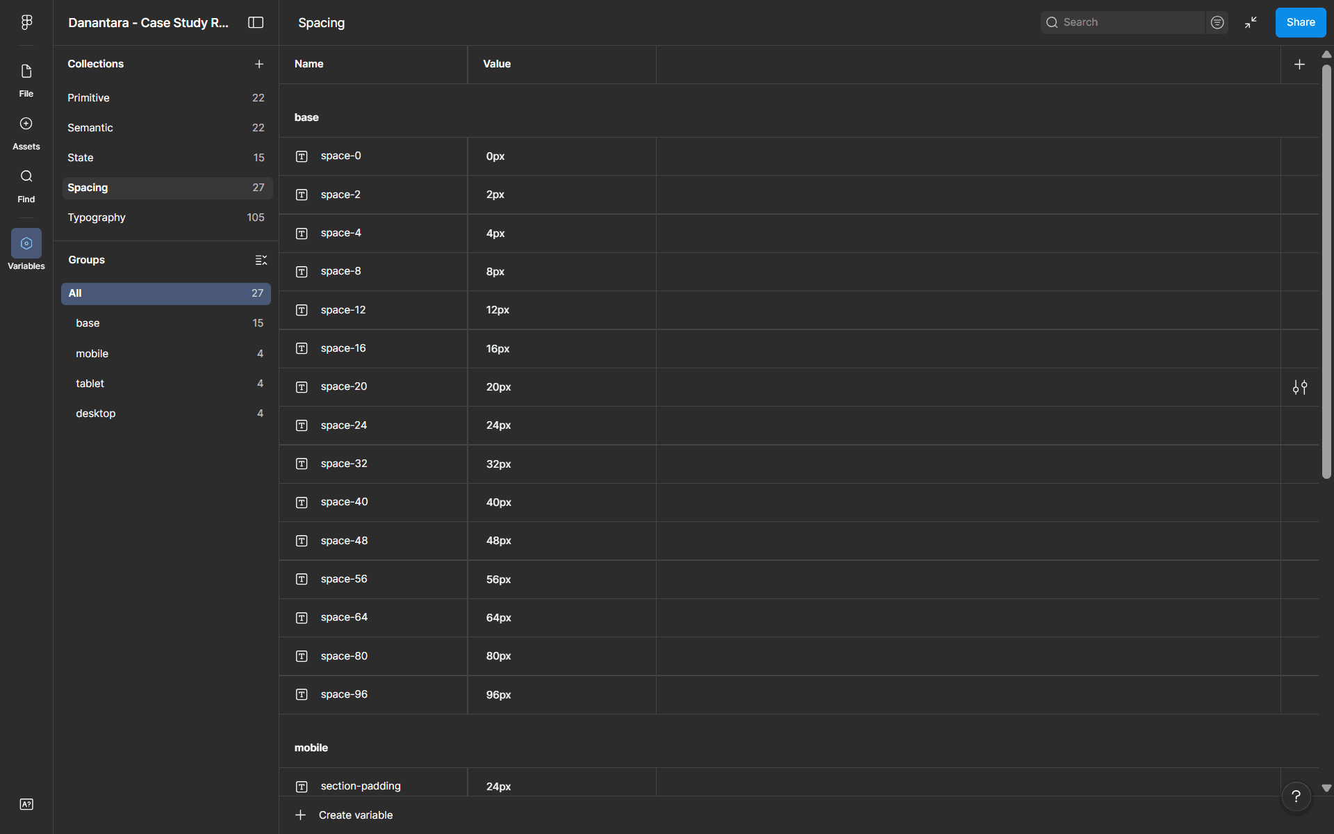
Spacing Token
I built the spacing system using a 4px scale to create consistent rhythm and alignment across the layout.
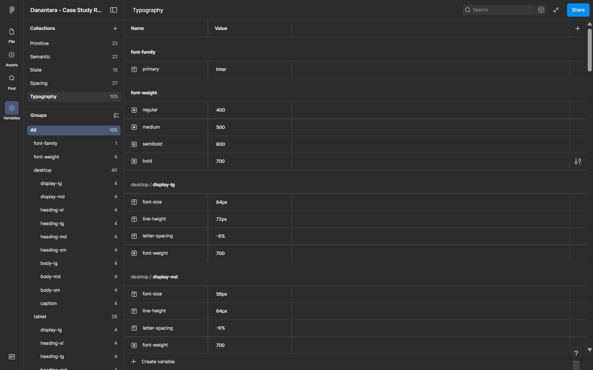
Typography Token
I chose Inter as the primary typeface for its readability and suitability for digital interfaces.
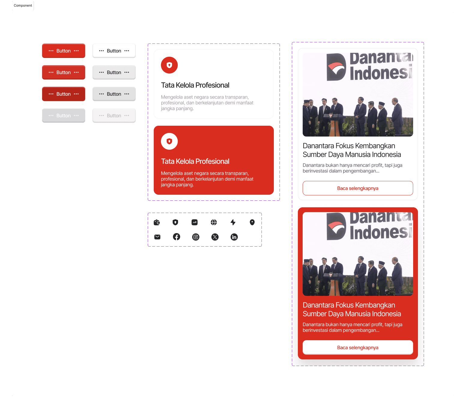
Component System
I designed reusable components such as buttons and cards to maintain consistency across the interface, while supporting different types of content like strategy programs and news.
Output Before & After Comparison
The following comparisons show how each identified problem was addressed in the redesign. The focus was on improving visual hierarchy, scannability, and trust signals.
Section 1: Hero & Navigation
Hero section redesigned with strong typographic hierarchy and immediate trust anchors.
Before
Unclear hierarchy, no CTA, navigation lacks visual weight
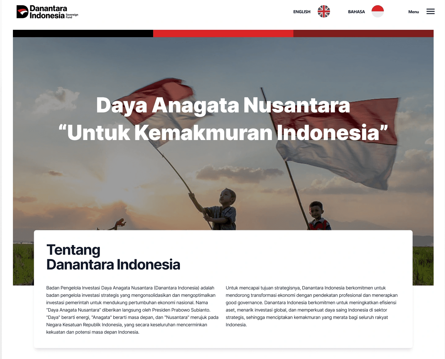
After
Clear headline structure, prominent CTA, accessible navigation with partners logos
Section 2: About / Intro Section
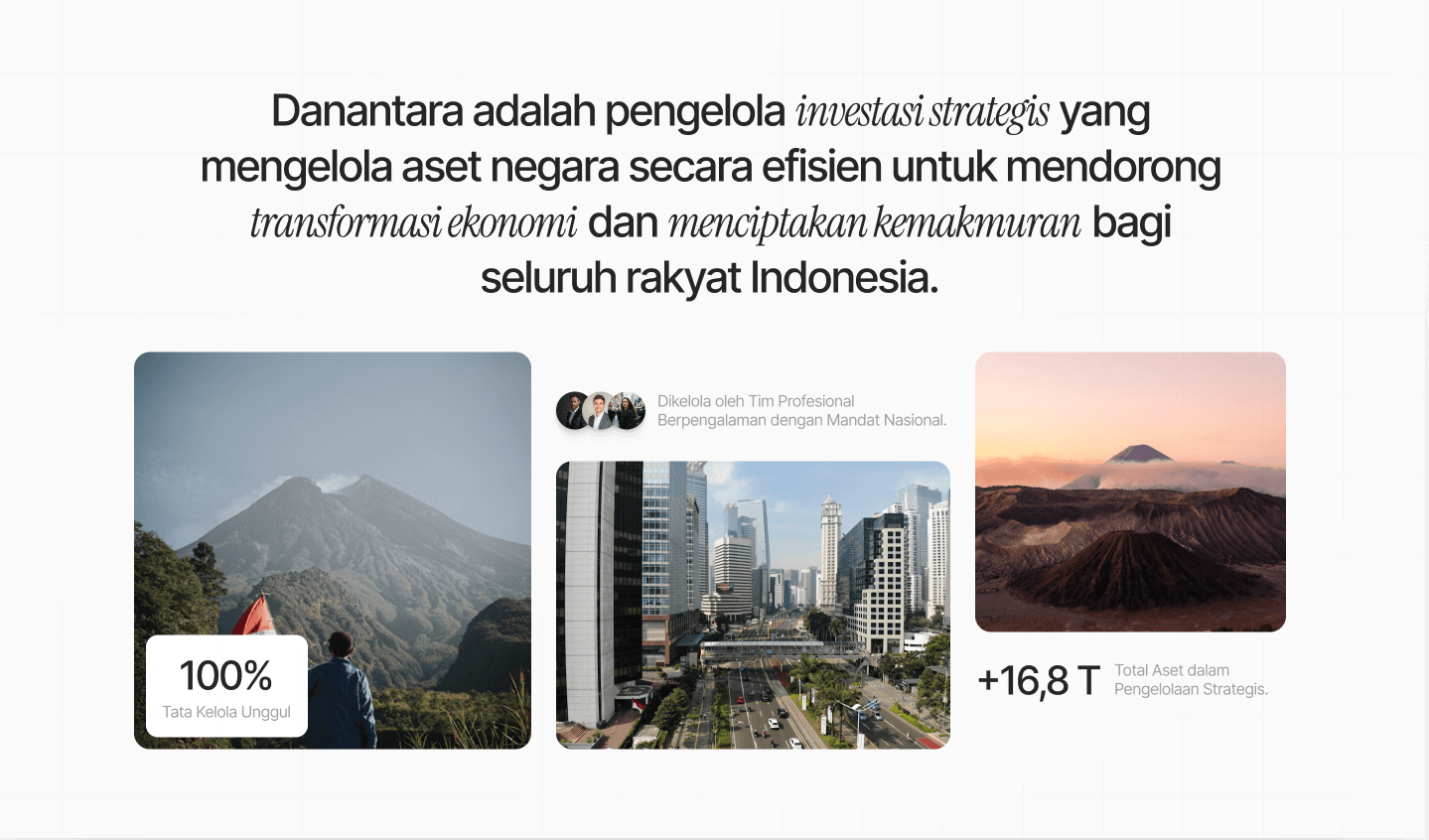
Key institutional data surfaced above the fold to build credibility immediately.
Before
Dense two-column text with no visual entry points
After
Scannable layout with key stats (100%, +16.8T) surfaced as visual anchors
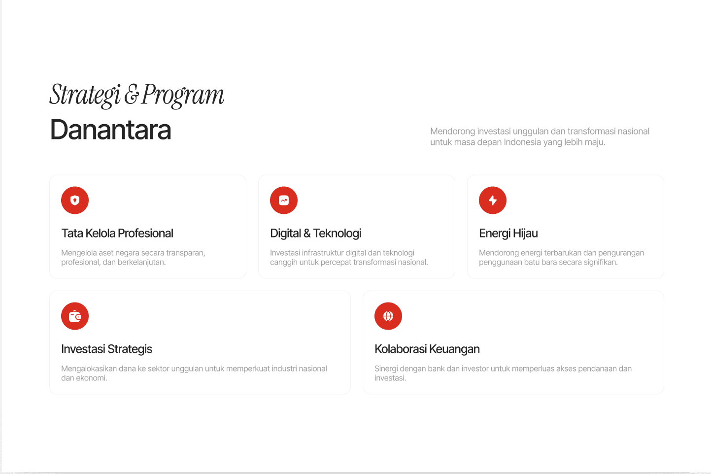
Section 3: Strategy & Program Section
Introduce Strategy Section based on vision & mission with card-based layout makes programs easy to scan and compare.
Before
Fragmented layout, programs hard to distinguish
After
Clean card grid with icons, clear program titles, consistent spacing
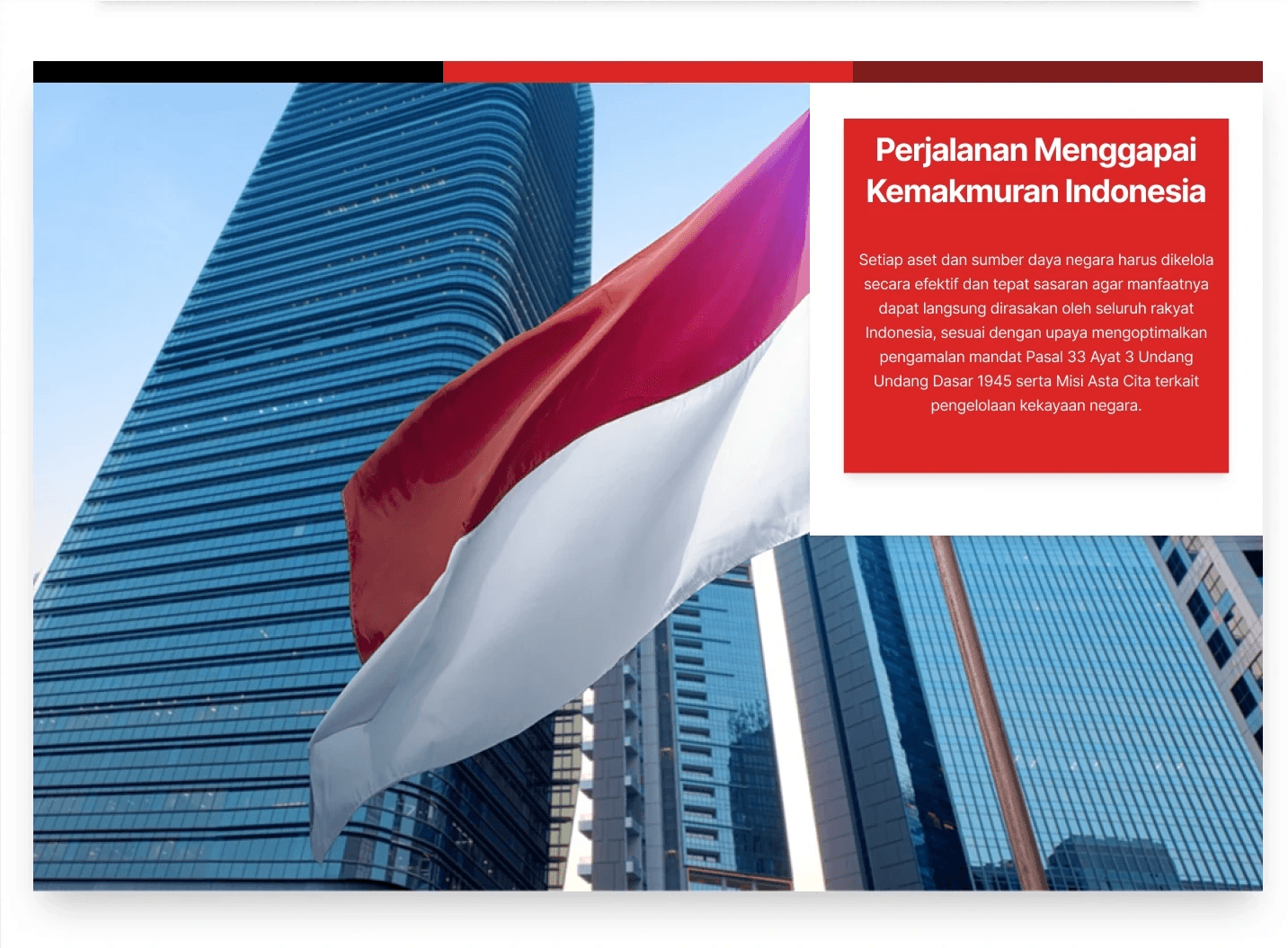
Section 4: Presidential Quote Section
Credibility signal redesigned to reinforce institutional authority.
Before
Awkward image placement, unpolished visual structure
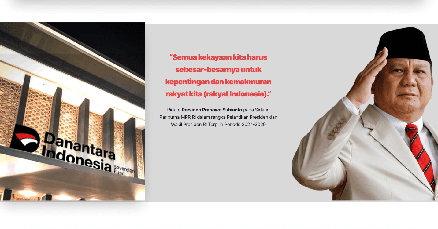
After
Refined portrait treatment with circular frame, strong typographic quote
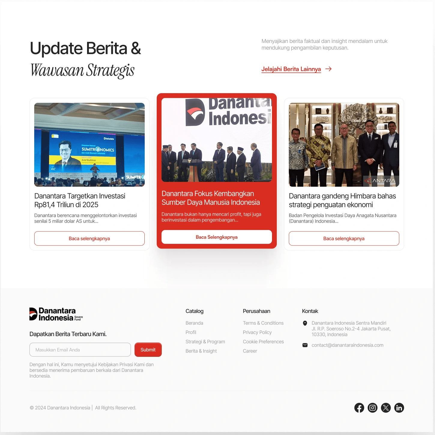
Section 5: News & Footer
Added a News & Insights section to surface institutional activity and build ongoing trust. Footer restructured with clear information hierarchy.
The Result of Design
More Details: https://shorturl.at/JAymR
Concept Validation via LinkedIn
While this is not a formal usability test, the strong engagement and positive feedback indicate that the redesigned concept is more intuitive and well-received.
Results
10K+ impressions
250+ reactions
30+ comments, mostly positive toward the redesigned concept
See the result: https://shorturl.at/AV3bA
Closing Reflection
This project reinforced that designing for public institutions is not just about aesthetic, it is about enabling clarity, building trust, and communicating responsibility effectively.
What I Learned?
Institutional credibility is communicated as much through visual structure as through content. Where information is placed matters as much as what is said.
What I'd do differently
With more time, I would conduct usability testing with actual users, especially non-designer audiences to validate whether the redesigned navigation and content structure actually reduces confusion in practice.